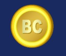
Here is an image I created some months back:
http://i1097.photobucket.com/albums/g352/kroptofer/bitcoin.jpgI don't know about you, but I still prefer the first logo which had the actual letters "BC" written on the coin
instead of the strange double strikethrough "B" :
It reminds me too much of the dollar and other currencies. Am I the only one bothered by this? Now, I'm obviously no graphic designer, but are there any out there who made logos with a similar way of thinking? (maybe some logos that don't look like the looney tunes title card, unlike mine)
By the way, I have been generating bitcoins since at least April '09, but this is my first post here. I guess I was starting to feel left out of the discussions.