Search content
Sort by
Showing 5 of 5 results by gordonc
Hi my name is Gordon.
I live in New York and recently redesigned the bitcoin logo.
http://handsomecode.tumblr.com/post/6565610892/designing-a-better-bitcoin-identity
I live in New York and recently redesigned the bitcoin logo.
http://handsomecode.tumblr.com/post/6565610892/designing-a-better-bitcoin-identity
See this post I just made....
http://forum.bitcoin.org/index.php?topic=17757.msg234282#msg234282
.... with the crap graphics.
That's a free letter that implies BT and can be freely claimed without pissing anyone off. Using that in a logo without the downmarket pawnbroker gold/yellow theme and we're onto a winner IMO. Whatever the end result, a rebranding is necessary.
Great, clean graphics work within the obvious limitations btw!
I'm thinking that instead of going for an ASCII symbol the default written form should be 'btC.' Simple, explanatory, no need for weird characters.
Planning to execute some identity designs based on 'btC' in the near future.
Hey - this is nice. Used to work for a font foundry years ago. Nice use of type.
Thanks! I love the whole Museo family...
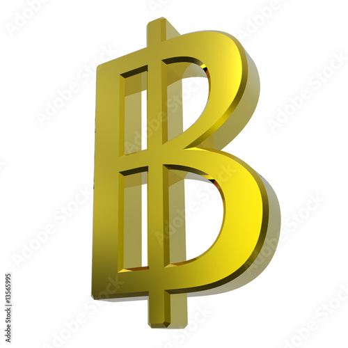
Good catch, I have to admit I have never seen Thai baht!
While a subtle point, I think there is a different between a striked ฿, as the Baht seems to universally use: http://www.google.com/search?um=1&hl=en&safe=off&biw=824&bih=718&tbm=isch&sa=1&q=thai+baht+symbol&oq=thai+baht+symbol&aq=f&aqi=&aql=&gs_sm=e&gs_upl=1868l2741l0l7l5l0l0l0l0l0l0ll0
and the modified B with and additional ascender and descender.
Anyway, the existing iconography seems to have the same problem:
http://bitcoin.nl/graphics/bitcoin_gold.png
http://t2.ftcdn.net/jpg/00/13/56/59/400_F_13565995_euO0qDXvjoo4qC1qidvWms2fEskp2t5X.jpg
This does beg the addition of treatment using 'btC' with perhaps another logo.
Hello internet!
I originally intended to post this as a reply to the thread here: http://forum.bitcoin.org/?topic=45.0 but I can only fucking post in this forum.
Anyway, I went ahead and did a bitcoin identity redesign project. The results are here: http://handsomecode.tumblr.com/post/6565610892/designing-a-better-bitcoin-identity and the source files are here: https://www.views.fm/gordonc/btcidentity
Feel free to re-use and repurpose. Have fun.
http://media.tumblr.com/tumblr_lmuol3zx9I1qznjpp.png
http://media.tumblr.com/tumblr_lmupioyU7M1qznjpp.png
http://media.tumblr.com/tumblr_lmuost1zBs1qznjpp.png